Drawing Tip No 10 – Creating depth like da Vinci

by Paul on September 24, 2009
in Drawing Tips

Drawing Tip No 10

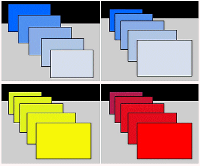
Leonardo Da Vinci suggested using progressively bluer colours the further away objects are to create depth.

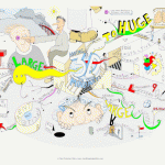
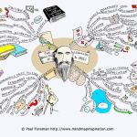
The tip is used in paintings although you can also use it for your Mind Map illustrations.

In the first of the examples above the darker blues appear further away even though the boxes are all the same size!

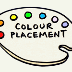
In the second of the blue images, adding perspective, the effect is even greater!

Subtle changes even to bold colours create depth.

Great tip from da Vinci :)

Discover more Drawing Tips for Mindmapping in my E-Books designed to help you create stylish and artistic mind maps of your own.

Share and Enjoy:
  • Twitter
  • del.icio.us
  • Digg
  • StumbleUpon
  • Google Bookmarks
  • Reddit
  • Facebook

Related Posts:

Comments

2 Responses to “Drawing Tip No 10 – Creating depth like da Vinci”
  1. Tim Fulford says:

    Is this why Fire Appliances are red and ambulances tend to be yellowish these days? So that they appear nearer and get our attention?
    Having said that Police vehicles seem to be blue and yellow………..
    I know there was a move to make all fire appliances yellow so they stood out more but this was found not to be effective.

  2. Paul says:

    Thanks for your comments Tim,

    I think contrast is very important – light against dark; shades and tones particularly in cases of safety.

    A red fire appliance, if it stands alone against a white background will be seen instantly – I feel the surroundings and placement are therefore extremely important. Even with a red decor you could place a contrasting board behind the appliance.

Share Your Thoughts