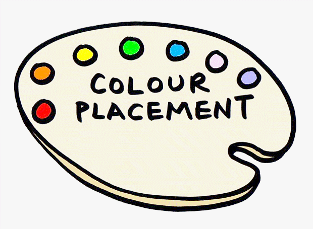
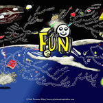
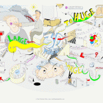
Using the seven colours of the rainbow as an example palette and the theme of a Mind Map here is a quick tip regarding colour placement
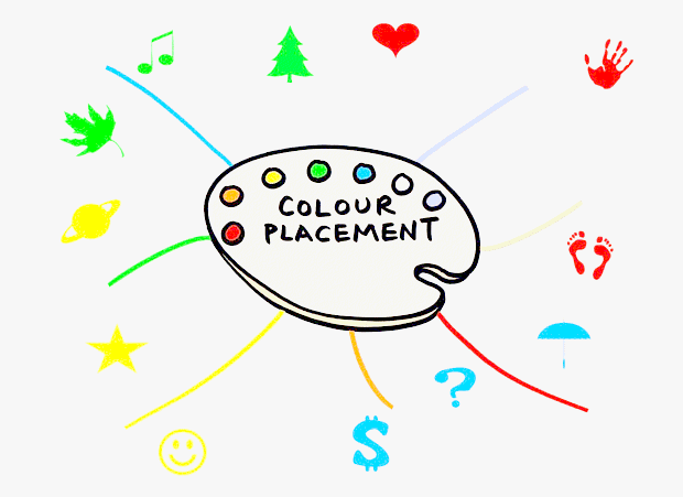
When adding images, the colour you use for each image has a dramatic effect on the overall appearance – I am using clip art here to demonstrate; view the colours only, rather than thinking what colour each object might normally be:
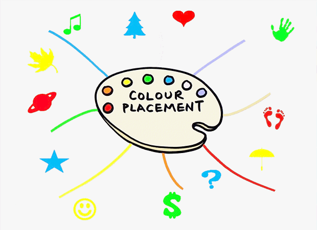
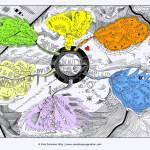
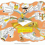
Colours rearranged, the images fall in similar areas yet this version is more interesting – the colours help bounce the eye around the Mind Map and also make it more pleasing to view as a whole:
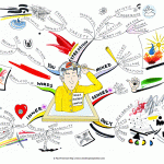
The ideas above are not hard and fast rules and the differences are often subtle, yet worth considering when building your Mind Maps or any other artistic compositions
Submit your review | |
Average rating: 0 reviews